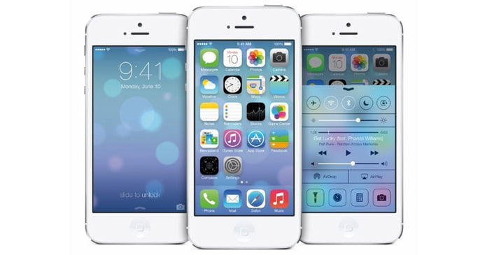
What are the highlights and disappointments? Has Apple found its own style in the "flattening" trend?
What do you think of the trend of the new system drawing on?
How about plagiarizing other mobile operating system like Android, Windows Phone and the APP of third party developers?
And what are your evaluations of other features and characteristics besides the interface?

Here is the view from a professional figure: The biggest problem Apple encountering is not the Flat Design or Materialized Design. The biggest problem lies in that there is no difference on usage experience between iPhone and Android. Although there is no doubt that iPhone is better, it is just like a metaphor. When two chickens stand together, no one cares who is bigger; but the difference is apparent when an ostrich and a chicken stand together. Now the relationship between iOS and Android is not an ostrich and a chicken and if you cannot keep the big difference, what makes your products more expensive than others?
Next are my impressions after seeing several introductions and videos.
It is true that many icons provoke a storm of criticism. Some icons are jazzy colors and confused light source, and some others are too big and differentiate in style. Why there are so many rough-and-tumble icons?
This is the main reason why many designers are dissatisfied with iOS 7. They are all deep in thought that why Apple did worse than me?

My point lies in that icon is truly quite important, but it is not the core of the operating system. As a designer, Jony Ive would first consider the overall structure and rules and then the icon. So, those icons probably designed at the last moment and the details would be adjusted one by one. Maybe we still dissatisfied with the adjustments, however I would like to believe in the aesthetic of Jony Ive.
Looking deeply, we can find that Jony Ive focuses on promoting the usage experience of the whole operating system.
For example, when unlocking the screen, the icons would fall to the desktop in different speed rather than all together. This is very interesting; when sending messages, those messages would be sent with head aslant. The most important is that he does a thing which is unnecessary. He redesigns all the previous applications and many application experiences which we are satisfied are improved, such as the browser, Calendar, App Store and SMS, etc. There is of course something poor, like Reminders.
The extensive use of white in iOS 7 gives me a new and classic impression. At the same time, iOS 7 adopts many "ground glass" designs (Jony Ive is famous for loving ground glass). Truly it is a mashup which makes people perplexed when viewed at first sight, but it reminds me of the feeling of drag and drop of several screens happened in science fiction movies. It is beautiful and fantastic.
In a word, although the icon of iOS 7 is quite strange, we can regain confidence if we see over the detailed design of each application. Though we have been aware that Apple is redesigning almost all its previous applications, we haven't predicted that it would redesign its applicatisons like this. From the general direction, I think it is right. Some details may be not so perfect, but they can be improved. The previous designs of Apple have been used for six and a half years. We may be satisfied with the previous designs, but can we accept the iOS 7 designs for a hundred years? Does Apple have to come out the new designs when people are all tired of the previous ones? I just prefer Apple to rush forward and this can show that this company is still in courage.
Metaphorically, anyone who wants to begin his new life is clear that the old life is just not poor, but there are too many good things; the new life is not so good, but it cannot just as well as the old life in a short while. What one needs when beginning new life and discarding the old life is decision instead of weighing and balancing. Apple has begun its new life and the small companies should start their new life as well.
We can simply see from what he says and many iOS 7 clips that Apple is willing to think of and change the mobile operating system.
People who do the products may understand that it is quite difficult to change the successful products heavily. All the colleagues would become the resistance involuntarily. People can always find out the reason to prove that there shouldn't be a big change. The three big challenges are: whether you can find out breakthrough thinking all by yourself; whether you have the decision and wouldn't be changed under others well-meaning suggestions; whether you possess the communication skills which make your own idea permeate into the team. It's quite hard to possess the three points at the same time.
It's true that there are many details which are not carried out quite well, like the design of icons, but Ive has make out many new usage experiences in the eight months from taking over designing software. The time frame is shorter than most product managers. He is famous for careful study of physical material characteristics and better usage of it. We can imagine what the situation will be when he knows software as better as hardware.
Altogether, iOS 7 beta is a product with 100-point direction and 50-point implementation. Jony Ive and his team have at last three months to complete the internal iteration and in the next five year, they have enough time to improve it gradually. Anyway, since iOS 4, this is the only iOS system that I prefer to install immediately the developer version to have a try after taking part in the conference. The world is new and it feels so good. Here back to the question answered at the beginning of the text. Apple is trying to provide the whole new usage experience of mobile operating system. There may be something we dislike and something took from others, but the "whole new usage experience" is just what we are seeking for everyday.